HAWK K&B


Choosing a Kitchen Worktop

Choosing a Kitchen Worktop

Kitchen worktops are one of the key elements that will bring your new kitchen together. Choosing the correct colour, material and finish can be a hard decision to make and whatever you choose needs to fit into your lifestyle and the way you use your kitchen.

Durability and low maintenance are often high up on the list of must haves for a kitchen worktop but style also needs to be considered. Here at Hawk K&B there are various worktop styles that we use to provide a solution to meet these expectations.

silestone-worktops-hawk-interiors
Image via Hawk K&B

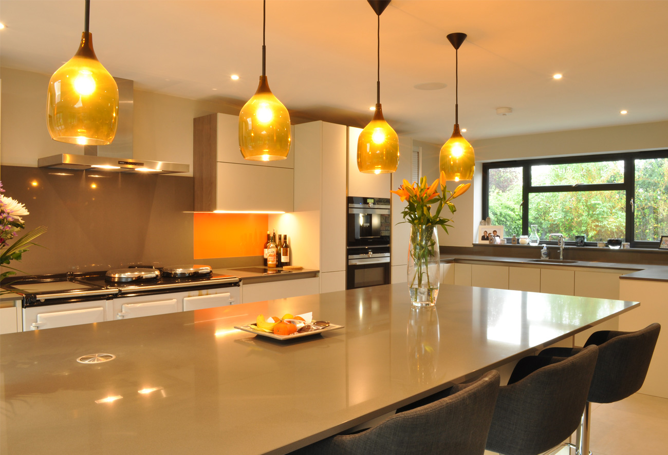
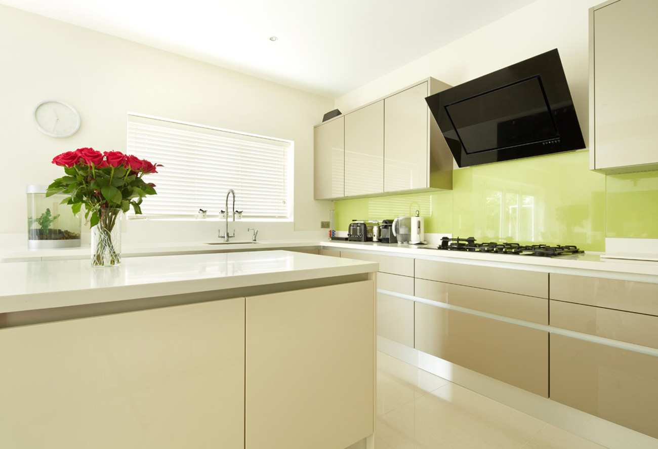
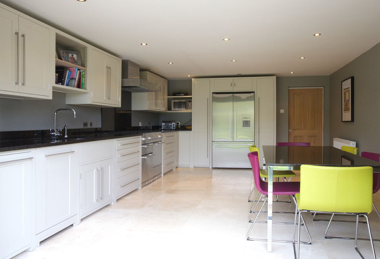
Our most popular choice of worktop is Silestone. Made of 94% natural quartz, it is extremely hard and resilient, making it excellent for kitchen worktops. The non-porous surface means it’s highly resistant to kitchen spills and stains and won’t allow any bacteria to grow.

The addition of small amounts of glass allows Silestone to come in more than 90 different colours and with three different textured finishes; it gives a refined and polished look to any new kitchen.

kitchen-worktops
Image via Hawk K&B

You can also cover not only worktops but also floors, walls or the front or downstand of your worktop with absolutely no joins, creating a beautifully seamless appearance. The addition of built in integrity sinks this year has added even more appeal to those wanting complete continuity in their kitchen.

Granite-worktops-hawk-interiors
Image via Hawk K&B

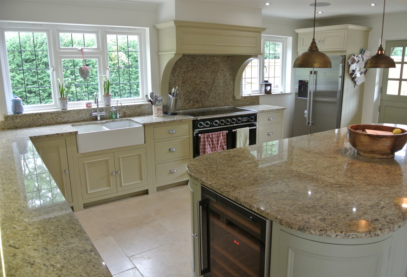
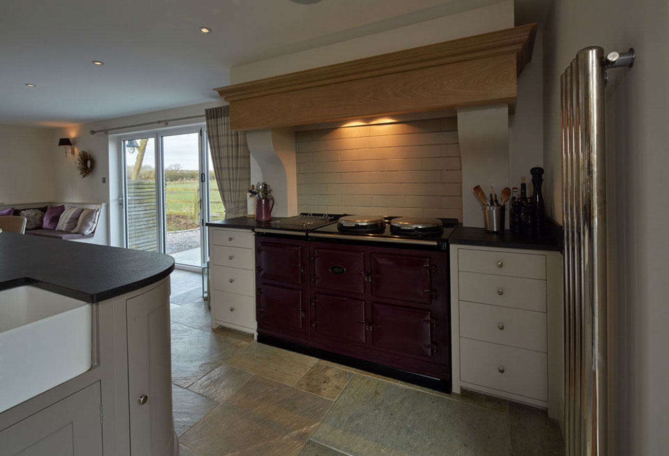
Another material that is widely appreciated in kitchen worktops is granite. This natural rock is cut in its natural state and then polished for use in the home, making every piece unique. Being such a strong material also means it is able to resist temperature changes and is difficult to scratch, however it isn’t completely maintenance free and requires careful cleaning to keep it in pristine condition.

Dekton-worktops-hawk-interiors-kitchen-design
Image sourced via Hawk K&B

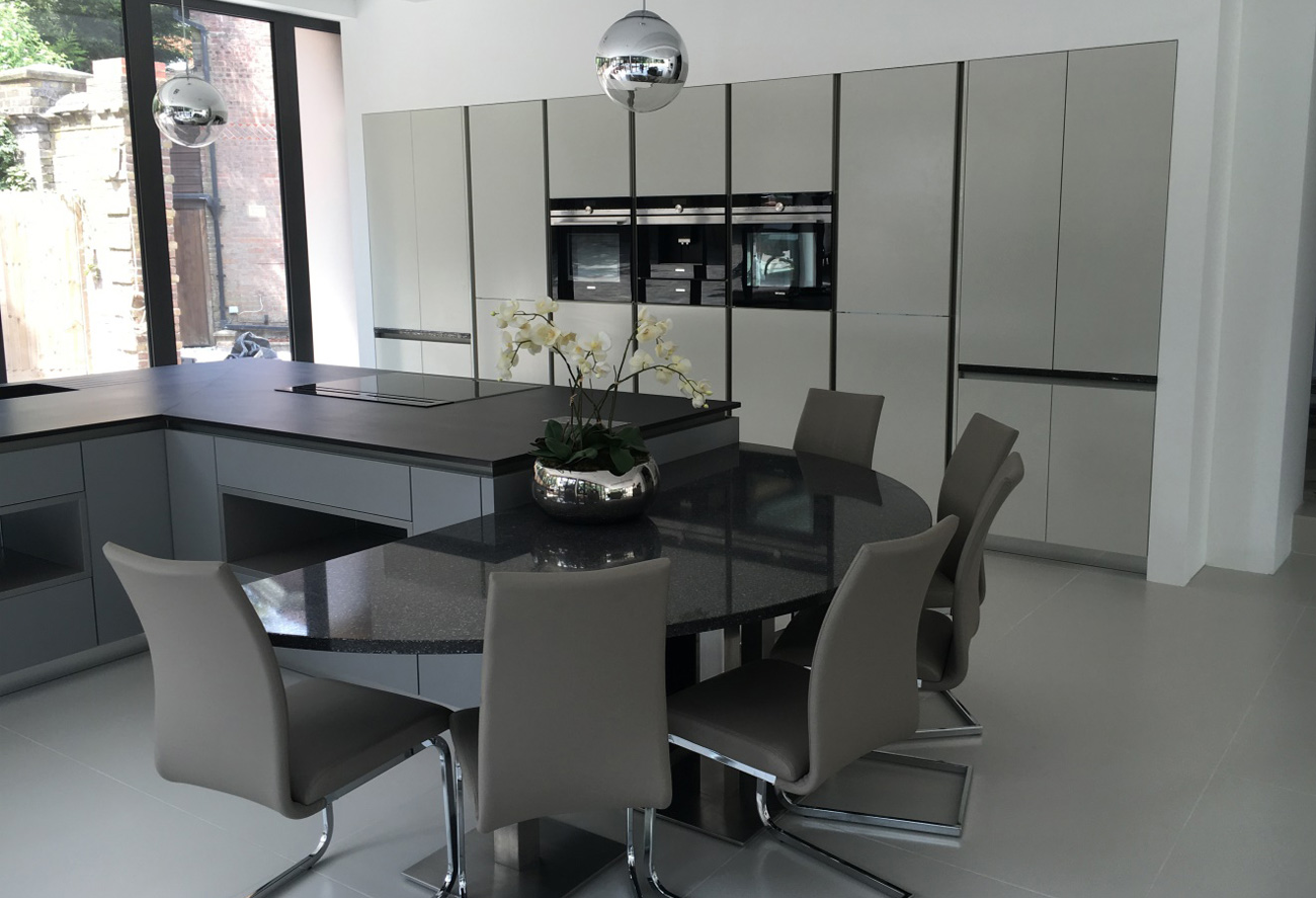
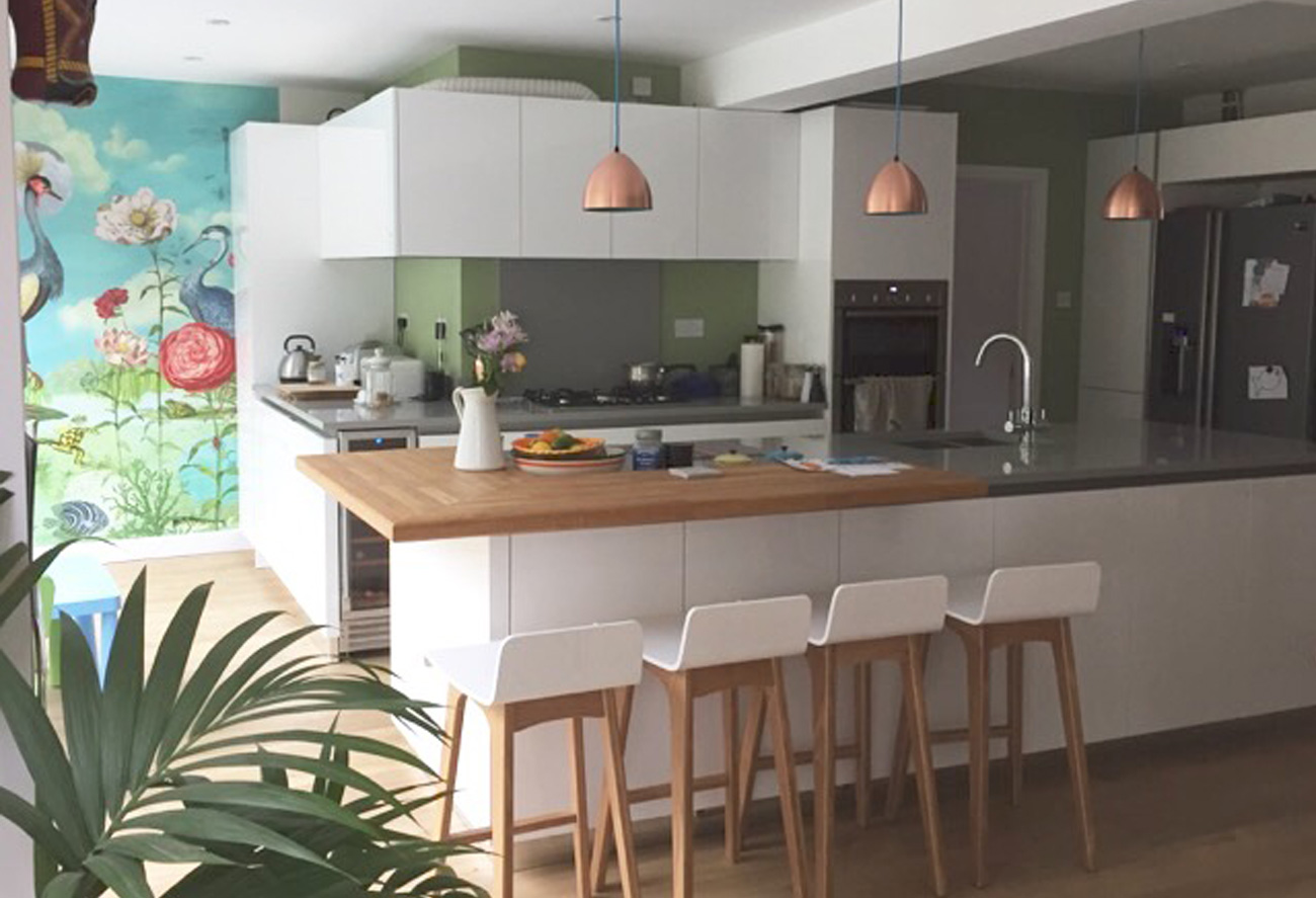
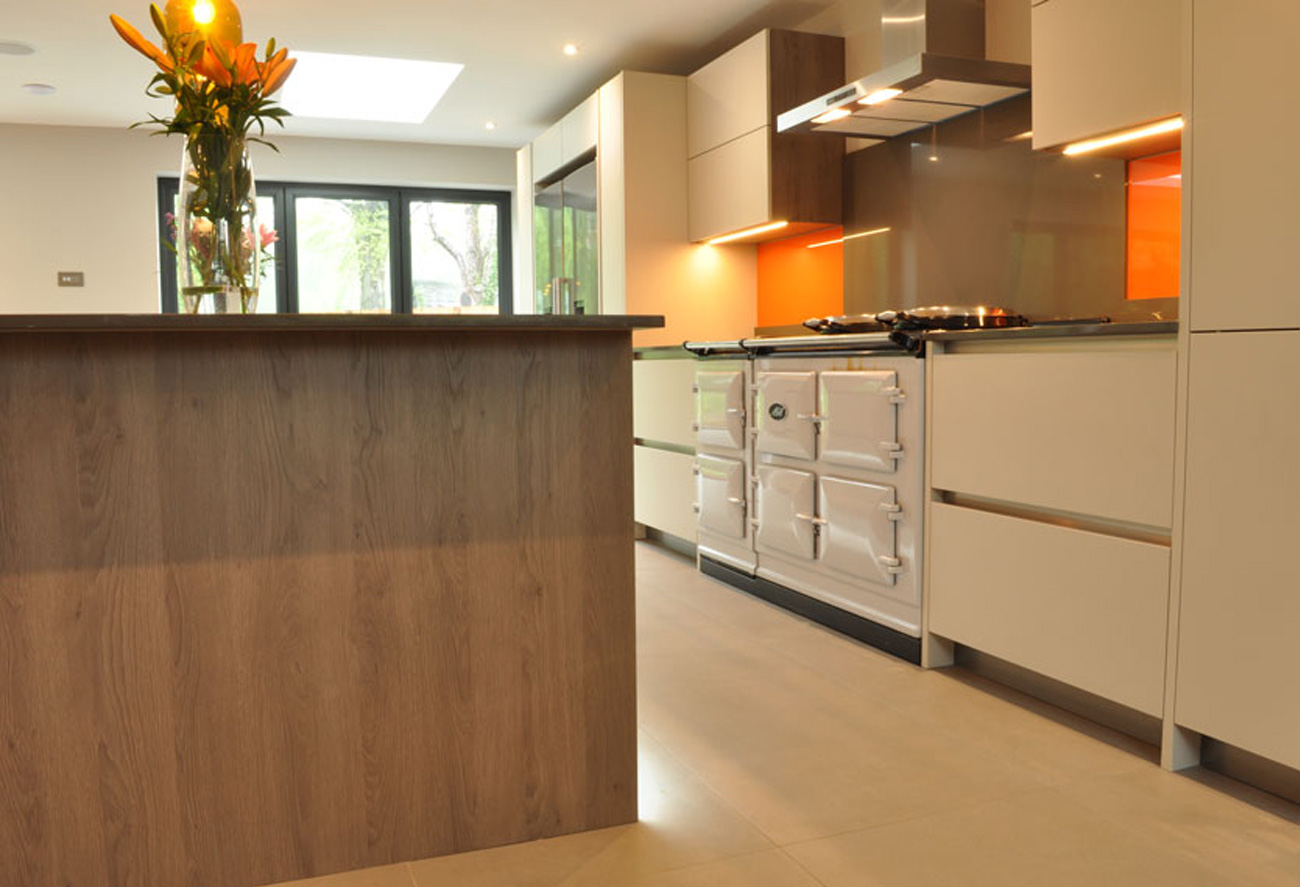
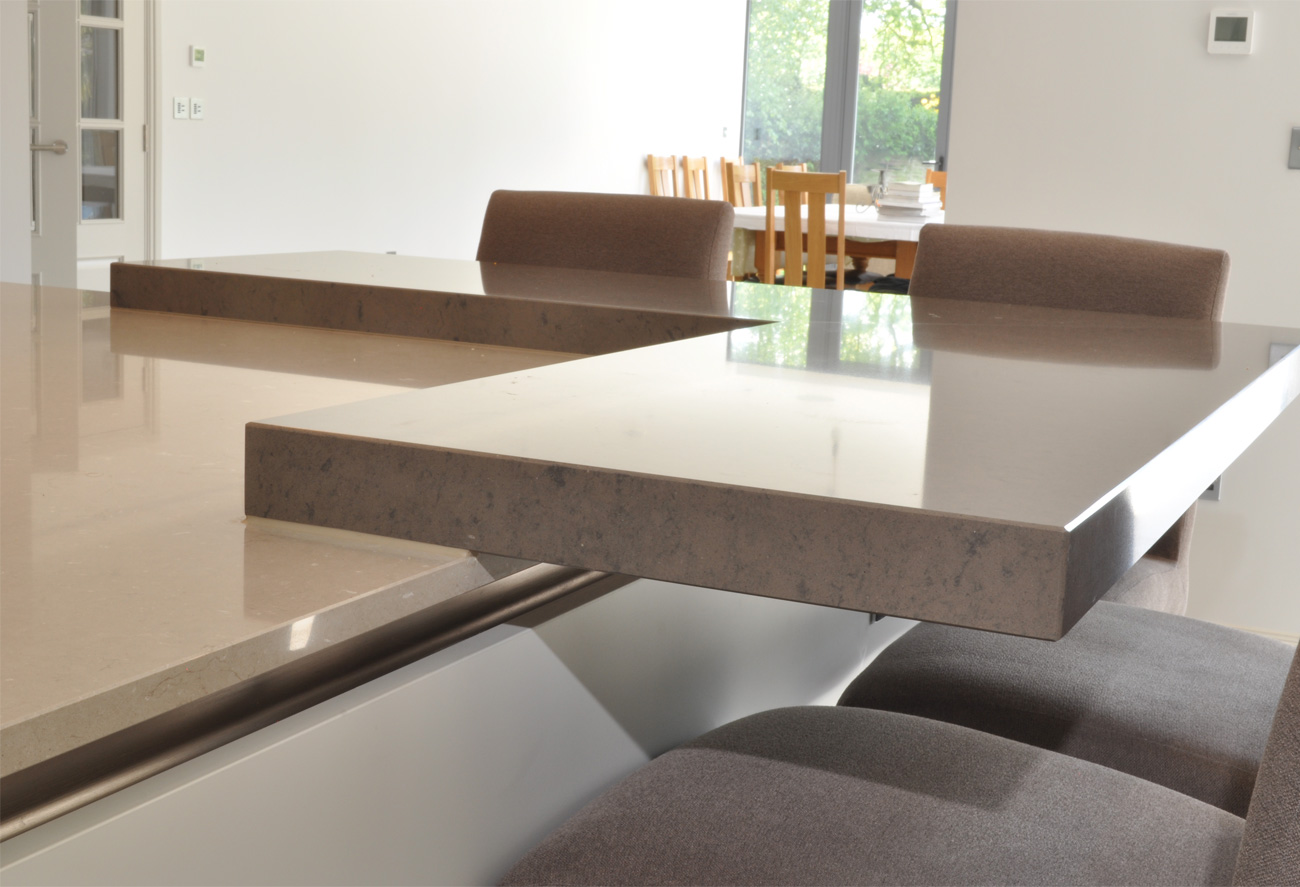
One of the latest worktop surfaces is Dekton. A sophisticated blend of the raw materials used in glass, porcelain and quartz surface production makes it a unique material that has endless potential for kitchen surfaces, not just worktops but outdoor surfaces too. Due to its construction, Dekton comes with all the properties we all want and need in a kitchen worktop. Among many other benefits, it’s highly scratch resistant, withstands high temperatures without burning, scorching or cracking (meaning hot pots can be placed directly onto it) and it’s completely stain proof.

Again coming in many colours and finishes, if offers lots of potential for mixing textures as we have done in the kitchen above to create a dynamic and striking space.

Green for 2017 – Pantone Colour of the Year

The announcement in December of ‘Greenery’ as the Pantone colour of the year for 2017 is a strong departure from the soft and calming hues of ‘Rose Quartz’ and ‘Serenity’ seen in 2016.

However ‘Greenery’ brings an alternative relaxation, the type induced by the calmness of nature, light green grass and sunlit leaves, adding an optimistic touch to the natural relaxing quality of green.

pantone-colour-of-2017-greenery-kitchen
Image via Hawk K&B

Such a fresh and vibrant colour is perfect for kitchens as there are so many different surfaces to inject colour onto. Walls, splashbacks, cabinetry and doors are great places to go green. Here the client chose a green glass splashback to make a bold statement in this kitchen.

Combined with neutral colours, the green becomes an accent colour, adding subtle drama without dominating the space. When used as the main hue throughout the scheme, it is best not to introduce too many other colours to ensure the most elegant and timeless execution.

jungle-green-pantone-greenery-2017-kitchen-design
Image via Hawk K&B

Greenery is perfect for prints too and we have seen jungle prints in a mix of green florals and foliage flooding interiors over the past few seasons. In this project above, the greenery from the feature wall is accented on the walls throughout this kitchen and as described as ‘natures neutral’ by Pantone, it’s a shade that can be paired with neutrals, brights, deeper shades, pastels and metallics – all of which can be seen above to create a beautiful vibrant space.

When executed properly green can enhance the core whites and earth tones in your design. A touch of Greenery in wall colour beautifully accents the core neutrals.

kitchens-green-for-2017-pantone
Image via Hawk K&B

Don’t forget to include natural green elements too. Incorporate fresh floral sprays, vegetables, leafy arrangements and ferns in your kitchen and bath designs. Even subtle injections of green through crockery, table linen or towels will instantly invigorate the space.

Image via Hawk K&B
Image via Hawk K&B

Pantone also notes that “Greenery is nature’s neutral.” It’s a lively hue that can’t help but channel exploration, innovation, health and more, making it a natural fit for the kitchen and dining room for the New Year.

Integrating an AGA into Your Kitchen

integrating-an-aga-kitchen-design
Image via Hawk K&B

Those who choose to integrate an AGA into their kitchen design are usually the people who have grown up with them, therefore know and appreciate their beauty and usage. However, if you are thinking of integrating an AGA into your kitchen design and are new to its benefits, take a look below at how this design icon can become the heart of your home and a beautiful addition to your kitchen.

Although 90 years old, the AGA can blend harmoniously into both classic and contemporary settings. With a variety of 12 different colours to suit any scheme, a classic AGA can be all the design statement you need in a kitchen. Surprisingly it doesn’t have to be the classic cream or black that fit with a traditional kitchen, here our client decided on purple which suits this country kitchen design perfectly.

integrating-an-aga-kitchen-design5
Image via Hawk K&B

And if your home boasts original beams or brickwork, leave them exposed to create maximum texture and country credibility.

integrating-an-aga-kitchen-design4
Image via Hawk K&B

In this more contemporary setting, the electric AGA in Pearl Ash contrasts yet complements the contemporary aesthetic. Alternatively choose a contemporary style AGA with a ceramic or gas top for an even sleeker look.

integrating-an-aga-kitchen-design2
Image via AGA

Again another benefit that means an AGA can fit into any setting is its number of fuel options; oil, natural and propane gas, or electricity. This greater flexibility is designed for modern day 21st century living, with the AGA Total Control allowing it to be turned on and off at the touch of button.

For many one of the key attributes that makes an AGA so appealing within a home is its constant radiating warmth. The family huddle around it and the kitchen is always guaranteed to be warm. However even with Total Control, you can still enjoy that indefinable ambient AGA warmth while managing the amount energy used through programming it to fit the rhythms of your daily life.

integrating-an-aga-kitchen-design3
Image via Hawk K&B

For smaller kitchens, AGA cookers also come in streamlined styles such as the City60 or a standard 3 oven style so you can integrate it into those slimmer settings.

wendover_kitchen_01
Image via Hawk K&B

Be it stand alone or sitting between kitchen cabinets, an AGA will always be the centrepiece to a kitchen, not only for its iconic aesthetics but also for its perfect marriage of design and superior performance and of course its unrivalled cooking abilities.

Pop into one of our showrooms to discuss integrating an AGA into your kitchen design.